3.1. Getting Started with Data Visualization
3.1.1. Preparation
Launch RTI Shapes Demo and publish a few squares with different colors.
3.1.2. Step 1: Switch to the Data Visualization Perspective
Click on the Switch to Data Visualization Perspective button
 on the toolbar or select the Data Visualization
Perspective entry under the Visualization menu.
on the toolbar or select the Data Visualization
Perspective entry under the Visualization menu.
In the Data Visualization Perspective, some Administration related views are hidden; to see them, click on the corresponding view icon in the toolbar or the View menu. To switch back to the Administration perspective, click on the Administration perspective button on the top-right corner:

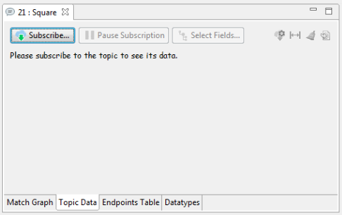
3.1.3. Step 2: Open the Topic Data Tab
From the DDS Logical View, click on the Square Topic to open the Topic View. In the Data Visualization perspective, it will automatically switch to the Topic Data tab, as seen below:
3.1.4. Step 3: Subscribe to a Topic
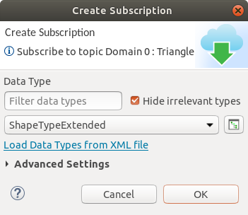
Click on the Subscribe… button  or right-click
on the Topic in the DDS Logical View and select Subscribe. This
will open the Create Subscription Dialog
seen below. You may expand the Advanced Settings to set the QoS,
Content Filter, or DataWriter Filter for the subscription. Click OK
to subscribe to the Topic.
or right-click
on the Topic in the DDS Logical View and select Subscribe. This
will open the Create Subscription Dialog
seen below. You may expand the Advanced Settings to set the QoS,
Content Filter, or DataWriter Filter for the subscription. Click OK
to subscribe to the Topic.
3.1.5. Step 4: Use the Topic Data Tab and Sample Inspector
After the Topic has been subscribed to, the Instances Table will show the latest data of all the instances that have been discovered so far. Select a row in the table to see the full data structure of the instance’s live data in the Sample Inspector view.
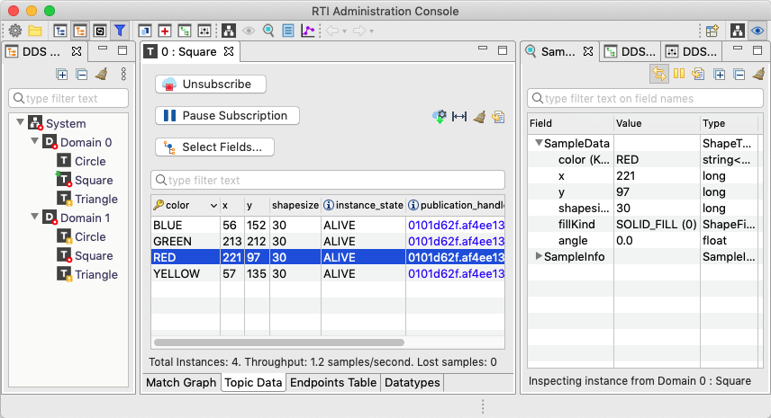
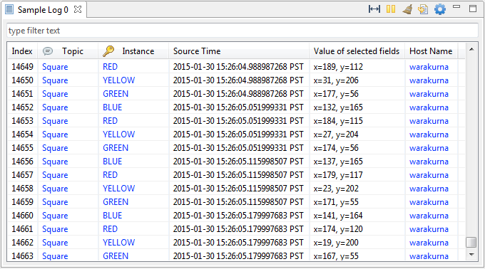
You can add and remove columns to the Instances Table by clicking on
the Select Fields… button 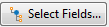 .
.
3.1.6. Step 5: Use the Sample Log
The Sample Log view logs every sample that has been received from selected Topics.
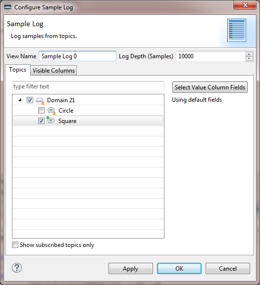
3.1.6.1. Configure the Sample Log
Click on the Sample Log button  on the toolbar or the
Sample Log entry in the Visualization menu. This will open a new Sample
Log view and its configuration dialog. In the configuration dialog, from the
Topics tab, you may select one or more Topics to log. In the Visible
Columns tab, you can select the columns that are visible in the table. You
can open the configuration dialog at any time by clicking on the Configure…
button
on the toolbar or the
Sample Log entry in the Visualization menu. This will open a new Sample
Log view and its configuration dialog. In the configuration dialog, from the
Topics tab, you may select one or more Topics to log. In the Visible
Columns tab, you can select the columns that are visible in the table. You
can open the configuration dialog at any time by clicking on the Configure…
button  .
.
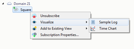
3.1.6.2. Add Topics to a Sample Log
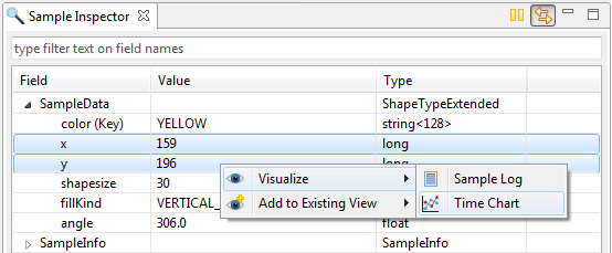
To directly visualize a Topic in a new Sample Log, right-click on a Topic or instance and select Visualize > Sample Log. If there are existing Sample Logs that are not logging this Topic, you can also use “Drag and Drop” or the Add to Existing View context menu to add the Topic to one of the existing Sample Logs. You may also add a DataWriter, DataReader, instance or field to a Sample Log, which will add the related Topic to the Sample Log.
3.1.6.3. Inspect a Sample
Select a row in the Sample Log to see its full data structure and values in the
Sample Inspector. When the Sample Log becomes
full, the oldest samples will be deleted when new samples arrive. Toggle the
pause button  to pause table updates. While paused, newly arriving
samples are still logged in the background. Toggle the pause button again to
resume updates.
to pause table updates. While paused, newly arriving
samples are still logged in the background. Toggle the pause button again to
resume updates.
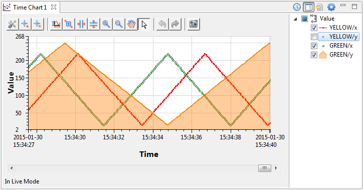
3.1.7. Step 6: Use the Time Chart
A Time Chart is a type of view that plots numeric fields in chart. It also supports saving and loading historical data.
3.1.7.1. Configure the Time Chart
Click on the Time Chart button  on the toolbar or the
Time Chart entry in the Visualization menu. This will open a new Time
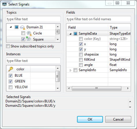
Chart view and its configuration dialog. The Select Signals dialog allows
you to select the signals to be plotted. First, you need to select the Topic.
Then the instances table will show all the instances that have been discovered
so far. Then you can select the instances and fields to be plotted.
Only numeric fields can be chosen.
on the toolbar or the
Time Chart entry in the Visualization menu. This will open a new Time
Chart view and its configuration dialog. The Select Signals dialog allows
you to select the signals to be plotted. First, you need to select the Topic.
Then the instances table will show all the instances that have been discovered
so far. Then you can select the instances and fields to be plotted.
Only numeric fields can be chosen.
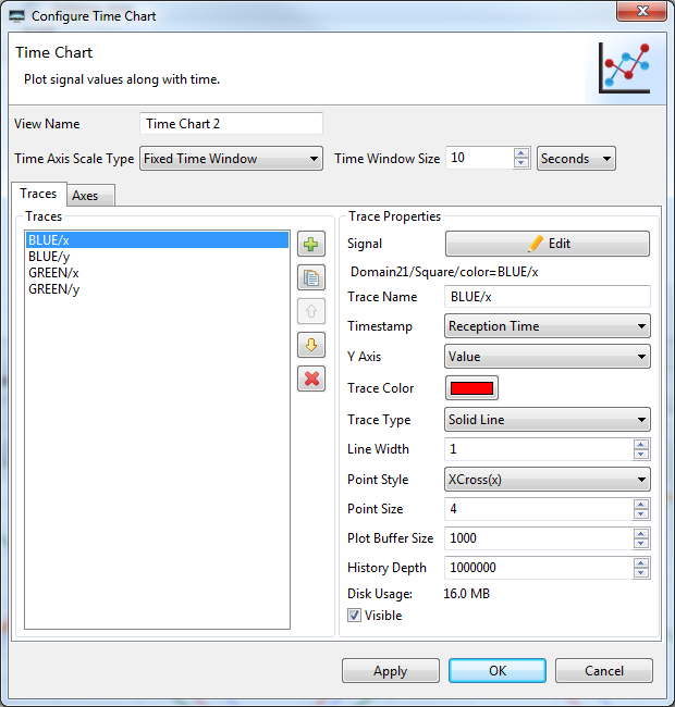
After the signals are selected, it will automatically create corresponding traces in the Time Chart Configuration dialog, as seen below. Each trace has some properties, such as Trace Color, Point Style, etc. You can select the trace from the Traces list and set its properties. You can add more Y axes to the chart from the Axes tab.
For the time axis, there are two modes:
Auto Scale: Automatically sets the time axis range to show all the samples in the plot buffer upon an update.
Fixed Time Window: Sets the time axis to a fixed time range.
You can open the configuration dialog at any time by clicking on the
Configure… button .
3.1.7.2. Add Signals to the Time Chart
To directly plot signals in a new Time Chart, right-click on one or multiple live numeric fields in the Sample Inspector and select Visualize > Time Chart. If there are existing Time Charts that are not plotting this field, use Drag and Drop or the Add to Existing View context menu to add the Topic to one of the existing Time Charts. You may also add Topics or instances to a time chart; in this case, the configuration dialogs will pop up and the Topics or instances will be preselected.
3.1.7.3. Use the Time Chart Toolbar
The Time Chart’s toolbar allows you to manipulate the chart at
runtime. When one of the zoom buttons  is selected, the
chart will stop auto-scaling or auto-scrolling so you can perform zoom or
panning operations by clicking on the plot or axes. Use the mouse wheel
to zoom in/out on plot area or axes. You can click on the toggled zoom
button again or the arrow button
is selected, the
chart will stop auto-scaling or auto-scrolling so you can perform zoom or
panning operations by clicking on the plot or axes. Use the mouse wheel
to zoom in/out on plot area or axes. You can click on the toggled zoom
button again or the arrow button ![]() to exit zooming and
restart auto-scaling or auto-scrolling.
to exit zooming and
restart auto-scaling or auto-scrolling.
3.1.7.4. Plot Historical Data
Historical data can be easily loaded by moving the bottom scroll bar
or clicking on the Switch to History Mode button  .
.
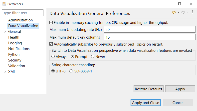
3.1.8. Step 7: Set Preferences
Use the Preferences dialog to customize your Data Visualization settings. To access, go to View > Preferences > Data Visualization.